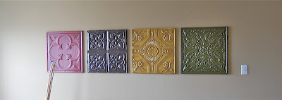
I'm excited to share one of my favorite transformations with you. As I mentioned in a previously post, I purchased these four tiles at Kirkland's a few years ago. At the time, they were the perfect colors for the room and went well with my window panels. Well, let me just say... this girl needed a change. In my opinion, the red was too bold for such a big room. I wanted a more relaxing space, it's true what they say about color, it can go a long way toward setting the mood and energy in a room.
I knew I wanted to keep the tiles because of their size and style. I've seen old architectural tiles at local antique shops and thought I could give them a similar look. First, I started by priming the walls. I needed to start with a clean slate to know just what color to use... that's how I roll. My daughter helped me prime over the red... princess style! :)
For the walls, I chose a beautiful grey blue by Behr called Silver Tinsel. I love this color! It's the perfect shade! After two coats on all three walls, I knew painting the tiles an off white would make them pop! Helpful tip: When painting over red (or any dark/bold color), use a tinted primer that is 70% of your new wall color.I scuffed up each tile with a 220 grit sand paper to help the primer stick. Then, I gave each one 2 coats of Sherwin Williams Dover White. I decided to distress them to give them that shabby vintage feel. I took a rag and put my beloved Ralph Lauren Smoke glaze all over, then whipped it off. Are you ready for the before and after? Okay, one more time... Here's the before:
And the after:
The room is still a work in progress, but toning down the walls with a more relaxing color made a HUGE difference. I'll give you a peek of how it looks now (minus the Christmas tree, of course). I haven't done anything but hang panels. Stay tuned to see what I plan to do with this room!On a recent trip to Goodwill, I discovered this clock for $3 dollars! I've been searching for a wall clock for our master bathroom. I love the detail! Come back and see what I did with her! Hope you're having a great day!


12 comments:
Hi Ava,
Your wall tiles are gorgeous and I love your room transformation. Your clock was such a great find! I hope you will stop over and visit me. Have a great day!
The walls and the tiles look great! I think they turned out lovely. Thanks for sharing!
Love the color and love the texture of these tiles!
great job
beautiful (even though I might never get over red, lol)! found you on momnivore's dilemma.
Great job on the tiles! Love the walla and the curtains, too.
The tiles look great-although I've got to say, I'm a red girl myself and think they looked great the old way too.
Your tiles look great- I love the texture they have and your room is so pretty too! Would love if you would come share these at Feathered Nest Friday sometime :)
such a nice, fresh update! We used to have a similar color (the red) in our master bedroom, and it is a ton of work. (going on and coming off!) love the makeover. Thanks for joining in at Transformations and Treasures!
Hi there~ just stopping back by to say thanks for sharing this at Feathered Nest Friday~ hope you will come back and share again soon! To answer your question- I found your blog at a linky party and popped over. Have a great day! :)
Thank you all for your sweet comments! <3
Oh, I love those wall tiles! Your color is beautiful and you're right the cream and gray is a gorgeous combination.
I love those wall tiles and how you've repainted them. I think they look so elegant! Thanks for sharing :)
Post a Comment